Style Customization
Customize the appearance of the Altruon payment component to match your brand by configuring styles during session creation.
Overview
Style customization is configured on your backend when creating a payment session. The styleCustomization object is passed as part of the session creation request body, and the styles are applied when the component renders on the frontend.
Key Points:
- ✅ Styles are configured during session creation (backend)
- ✅ No frontend JavaScript configuration needed
- ✅ Styles apply automatically when component renders
- ✅ Consistent styling across all payment methods
Working example: the Altruon Merchant Demo maps its storefront branding onto
styleCustomizationso the embedded component visually matches the host page. SeebuildStyleCustomization()inserver/src/routes.js:function buildStyleCustomization(branding = {}) {
return {
backgroundColor: "#FFFFFF",
primaryColor: "#E2E8F0", // input borders / dividers inside the component
secondaryColor: "#FFFFFF",
accentColor: branding.primaryColor || "#6366F1", // buttons & focus states
borderRadius: "10px",
headerTextColor: "#0F172A",
textColor: "#0F172A",
fontFamily: "'Inter', -apple-system, BlinkMacSystemFont, 'Segoe UI', sans-serif",
dropShadow: false,
};
}
How to Customize Styles
Backend Configuration
When creating a session, include the styleCustomization object in your request:
// Node.js / Express example
const response = await fetch('https://{your-domain}.api.sandbox.altruon.io/api/session/v1/create', {
  method: 'POST',
  headers: {
    'Content-Type': 'application/json',
    'x-secret-key': process.env.ALTRUON_SECRET_KEY
  },
  body: JSON.stringify({
    paymentData: {
      currency: 'USD',
      paymentMethod: 'card'
    },
    redirectUrl: 'https://yourdomain.com/success',
    billingData: {
      lineItems: [
        {
          type: 'plan',
          id: 'price_1SMtJj4hYau76GhIakR22BKu',
          quantity: '1'
        }
      ],
      billingPlatformId: '3287b8c7-ce43-41fd-9d58-f510e610b8f3'
    },
    styleCustomization: {
      backgroundColor: '#3a3a3a',
      primaryColor: '#4B5563',
      secondaryColor: '#3a3a3a',
      accentColor: '#5B7FFF',
      borderRadius: '5px',
      headerTextColor: '#ffffff',
      fontFamily: 'Verdana, cursive',
      textColor: '#ffffff',
      dropShadow: false
    }
  })
});
Frontend Usage
Once the session is created with custom styles, simply render the component - the styles will be applied automatically:
// Frontend - No style configuration needed
altruon
  .init("pk_sandbox_your_key", "your-domain")
  .on("onSuccess", (data) => window.location.href = '/success');

altruon.setSession(sessionId); // Session already has styles configured
altruon.renderComponent('#payment-container'); // Styles apply automatically
Style Customization Options
Complete Configuration Object
{
  styleCustomization: {
    backgroundColor: string;      // Component background color
    primaryColor: string;         // Primary interactive elements color
    secondaryColor: string;       // Secondary elements color
    accentColor: string;          // Accent color for highlights
    borderRadius: string;         // Border radius for rounded corners
    headerTextColor: string;      // Header text color
    fontFamily: string;           // Font family for all text
    textColor: string;            // Body text color
    dropShadow: boolean;          // Whether to show drop shadows
  }
}
Property Descriptions
| Property | Type | Default | Description |
|---|---|---|---|
backgroundColor | string | #ffffff | Background color of the payment component |
primaryColor | string | #4B5563 | Color for primary buttons and interactive elements |
secondaryColor | string | #9CA3AF | Color for secondary elements and borders |
accentColor | string | #3B82F6 | Accent color for focus states and highlights |
borderRadius | string | 8px | Border radius for rounded corners (e.g., "5px", "12px") |
headerTextColor | string | #1F2937 | Color for header text and titles |
fontFamily | string | system-ui, sans-serif | Font family for all text in the component |
textColor | string | #1F2937 | Color for body text and labels |
dropShadow | boolean | true | Whether to display drop shadows on the component |
Style Parameter Visual Guide
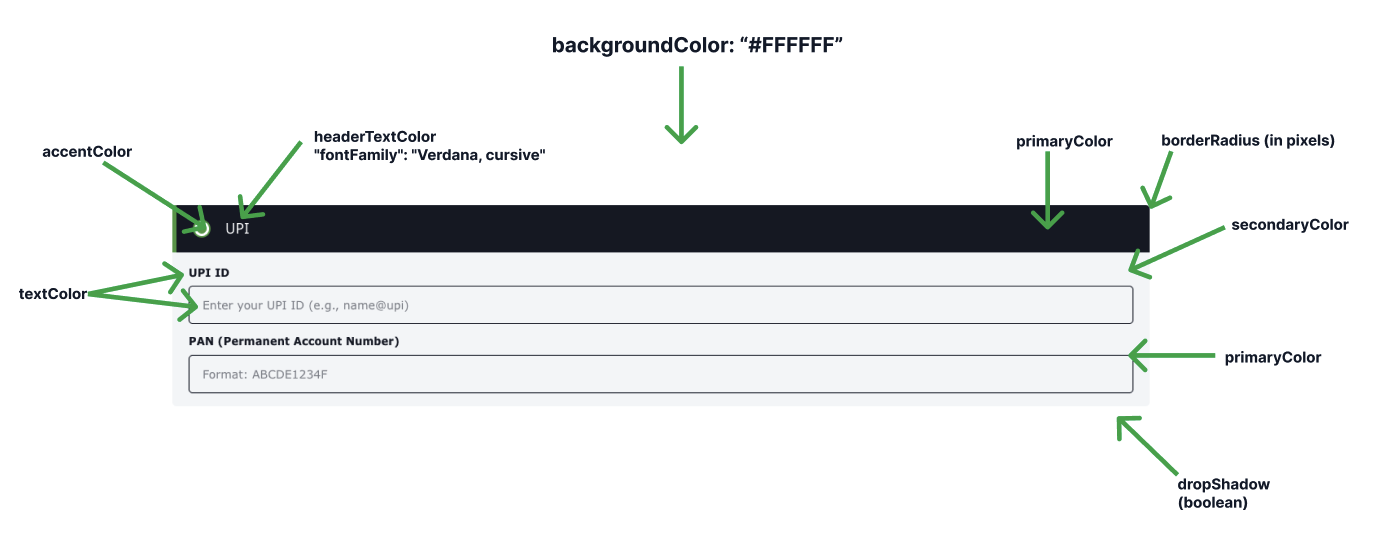
Style parameters and their effects:
Visual breakdown:
- backgroundColor - The main background of the entire component
- primaryColor - Submit buttons and primary action elements
- secondaryColor - Input field borders and secondary UI elements
- accentColor - Focus states, active elements, and hover effects
- borderRadius - Rounded corners on all elements (buttons, inputs, cards)
- headerTextColor - Color of titles and section headers
- fontFamily - Typography used throughout the component
- textColor - Labels, descriptions, and body text
- dropShadow - Shadow effects on cards and elevated elements
Style Examples
Example 1: Dark Theme
styleCustomization: {
  backgroundColor: '#1F2937',
  primaryColor: '#3B82F6',
  secondaryColor: '#374151',
  accentColor: '#60A5FA',
  borderRadius: '8px',
  headerTextColor: '#F9FAFB',
  fontFamily: 'Inter, system-ui, sans-serif',
  textColor: '#E5E7EB',
  dropShadow: true
}
Use case: Modern dark mode interface
Example 2: Minimal Light Theme
styleCustomization: {
  backgroundColor: '#FFFFFF',
  primaryColor: '#000000',
  secondaryColor: '#E5E5E5',
  accentColor: '#000000',
  borderRadius: '0px',
  headerTextColor: '#000000',
  fontFamily: 'Arial, sans-serif',
  textColor: '#333333',
  dropShadow: false
}
Use case: Clean, minimalist design with sharp edges
Example 3: Colorful Brand Theme
styleCustomization: {
  backgroundColor: '#FFF5F7',
  primaryColor: '#EC4899',
  secondaryColor: '#FBE2EB',
  accentColor: '#F472B6',
  borderRadius: '16px',
  headerTextColor: '#BE185D',
  fontFamily: '"Poppins", sans-serif',
  textColor: '#831843',
  dropShadow: true
}
Use case: Vibrant, brand-focused design
Example 4: Corporate Professional
styleCustomization: {
  backgroundColor: '#F8F9FA',
  primaryColor: '#0056B3',
  secondaryColor: '#6C757D',
  accentColor: '#007BFF',
  borderRadius: '4px',
  headerTextColor: '#212529',
  fontFamily: '"Roboto", sans-serif',
  textColor: '#495057',
  dropShadow: true
}
Use case: Professional, enterprise-grade appearance
Example 5: High Contrast
styleCustomization: {
  backgroundColor: '#FFFFFF',
  primaryColor: '#D97706',
  secondaryColor: '#92400E',
  accentColor: '#F59E0B',
  borderRadius: '12px',
  headerTextColor: '#78350F',
  fontFamily: 'system-ui, sans-serif',
  textColor: '#1C1917',
  dropShadow: true
}
Use case: Accessibility-focused, high contrast design
Backend Implementation Examples
Node.js / Express
app.post('/create-checkout-session', async (req, res) => {
  const { planId, billingPlatformId } = req.body;

  try {
    const response = await fetch(
      'https://mycompany.api.sandbox.altruon.io/api/session/v1/create',
      {
        method: 'POST',
        headers: {
          'Content-Type': 'application/json',
          'x-secret-key': process.env.ALTRUON_SECRET_KEY
        },
        body: JSON.stringify({
          paymentData: {
            currency: 'USD',
            paymentMethod: 'card'
          },
          redirectUrl: 'https://mycompany.com/success',
          billingData: {
            lineItems: [
              {
                type: 'plan',
                id: planId,
                quantity: '1'
              }
            ],
            billingPlatformId
          },
          styleCustomization: {
            backgroundColor: '#FFFFFF',
            primaryColor: '#0066FF',
            secondaryColor: '#E5E7EB',
            accentColor: '#0052CC',
            borderRadius: '8px',
            headerTextColor: '#1F2937',
            fontFamily: '"Inter", system-ui, sans-serif',
            textColor: '#374151',
            dropShadow: true
          }
        })
      }
    );

    const data = await response.json();
    res.json({ sessionId: data.session_id });
  } catch (error) {
    res.status(500).json({ error: error.message });
  }
});
Python / Flask
@app.route('/create-checkout-session', methods=['POST'])
def create_checkout_session():
    data = request.get_json()

    try:
        response = requests.post(
            'https://mycompany.api.sandbox.altruon.io/api/session/v1/create',
            headers={
                'Content-Type': 'application/json',
                'x-secret-key': os.environ.get('ALTRUON_SECRET_KEY')
            },
            json={
                'paymentData': {
                    'currency': 'USD',
                    'paymentMethod': 'card'
                },
                'redirectUrl': 'https://mycompany.com/success',
                'billingData': {
                    'lineItems': [
                        {
                            'type': 'plan',
                            'id': data.get('planId'),
                            'quantity': '1'
                        }
                    ],
                    'billingPlatformId': data.get('billingPlatformId')
                },
                'styleCustomization': {
                    'backgroundColor': '#FFFFFF',
                    'primaryColor': '#0066FF',
                    'secondaryColor': '#E5E7EB',
                    'accentColor': '#0052CC',
                    'borderRadius': '8px',
                    'headerTextColor': '#1F2937',
                    'fontFamily': '"Inter", system-ui, sans-serif',
                    'textColor': '#374151',
                    'dropShadow': True
                }
            }
        )

        response.raise_for_status()
        result = response.json()
        return jsonify({'sessionId': result['session_id']})

    except requests.exceptions.RequestException as e:
        return jsonify({'error': str(e)}), 500
PHP / Laravel
public function createCheckoutSession(Request $request)
{
    try {
        $response = Http::withHeaders([
            'Content-Type' => 'application/json',
            'x-secret-key' => env('ALTRUON_SECRET_KEY')
        ])->post(
            'https://mycompany.api.sandbox.altruon.io/api/session/v1/create',
            [
                'paymentData' => [
                    'currency' => 'USD',
                    'paymentMethod' => 'card'
                ],
                'redirectUrl' => 'https://mycompany.com/success',
                'billingData' => [
                    'lineItems' => [
                        [
                            'type' => 'plan',
                            'id' => $request->input('planId'),
                            'quantity' => '1'
                        ]
                    ],
                    'billingPlatformId' => $request->input('billingPlatformId')
                ],
                'styleCustomization' => [
                    'backgroundColor' => '#FFFFFF',
                    'primaryColor' => '#0066FF',
                    'secondaryColor' => '#E5E7EB',
                    'accentColor' => '#0052CC',
                    'borderRadius' => '8px',
                    'headerTextColor' => '#1F2937',
                    'fontFamily' => '"Inter", system-ui, sans-serif',
                    'textColor' => '#374151',
                    'dropShadow' => true
                ]
            ]
        );

        if (!$response->successful()) {
            throw new \Exception('Failed to create session');
        }

        return response()->json([
            'sessionId' => $response->json()['session_id']
        ]);
    } catch (\Exception $e) {
        return response()->json(['error' => $e->getMessage()], 500);
    }
}
Dynamic Styling
You can create different styles for different plans, user types, or contexts:
// Helper function to get style configuration
function getStyleForPlan(planType) {
  const styles = {
    basic: {
      backgroundColor: '#F9FAFB',
      primaryColor: '#6B7280',
      secondaryColor: '#D1D5DB',
      accentColor: '#9CA3AF',
      borderRadius: '4px',
      headerTextColor: '#1F2937',
      fontFamily: 'system-ui, sans-serif',
      textColor: '#374151',
      dropShadow: false
    },
    premium: {
      backgroundColor: '#FFFFFF',
      primaryColor: '#3B82F6',
      secondaryColor: '#BFDBFE',
      accentColor: '#60A5FA',
      borderRadius: '8px',
      headerTextColor: '#1E40AF',
      fontFamily: '"Inter", sans-serif',
      textColor: '#1F2937',
      dropShadow: true
    },
    enterprise: {
      backgroundColor: '#1F2937',
      primaryColor: '#F59E0B',
      secondaryColor: '#374151',
      accentColor: '#FBBF24',
      borderRadius: '12px',
      headerTextColor: '#FCD34D',
      fontFamily: '"Roboto", sans-serif',
      textColor: '#F3F4F6',
      dropShadow: true
    }
  };

  return styles[planType] || styles.basic;
}

// Use in session creation
app.post('/create-checkout-session', async (req, res) => {
  const { planType } = req.body;
  const styleConfig = getStyleForPlan(planType);

  const response = await fetch(sessionEndpoint, {
    method: 'POST',
    headers: { /* ... */ },
    body: JSON.stringify({
      // ... other fields
      styleCustomization: styleConfig
    })
  });

  // ...
});
Best Practices
1. Maintain Brand Consistency
Match your existing website design:
styleCustomization: {
  backgroundColor: '#FFFFFF',
  primaryColor: '#YOUR_BRAND_COLOR',  // Use your brand's primary color
  fontFamily: '"YourBrandFont", sans-serif',
  // ... other properties
}
2. Ensure Readability
Always test text contrast:
// ✅ Good contrast
{
  backgroundColor: '#FFFFFF',
  textColor: '#1F2937'  // Dark text on light background
}

// ❌ Poor contrast
{
  backgroundColor: '#EFEFEF',
  textColor: '#D1D1D1'  // Light text on light background - hard to read
}
3. Consider Accessibility
- Maintain WCAG AA contrast ratios (4.5:1 for normal text)
- Use readable font sizes (minimum 14px)
- Ensure focus states are visible (accentColor)
4. Test on Multiple Devices
Test your custom styles on:
- Desktop browsers (Chrome, Firefox, Safari, Edge)
- Mobile devices (iOS, Android)
- Different screen sizes
- Light and dark system themes
5. Use Web-Safe Fonts
If using custom fonts, ensure they load properly:
fontFamily: '"CustomFont", "Fallback Font", sans-serif'
Or stick to system fonts for best performance:
fontFamily: 'system-ui, -apple-system, BlinkMacSystemFont, "Segoe UI", sans-serif'
Color Format Support
Altruon supports multiple color formats:
styleCustomization: {
  // Hex colors
  backgroundColor: '#FFFFFF',
  primaryColor: '#3B82F6',

  // RGB colors
  secondaryColor: 'rgb(229, 231, 235)',

  // RGBA colors (with transparency)
  accentColor: 'rgba(59, 130, 246, 0.8)',

  // Named colors
  textColor: 'black',
  headerTextColor: 'darkslategray'
}
Recommendation: Use hex colors for consistency and clarity.
Common Use Cases
E-commerce Checkout
styleCustomization: {
  backgroundColor: '#FFFFFF',
  primaryColor: '#10B981',
  secondaryColor: '#D1FAE5',
  accentColor: '#059669',
  borderRadius: '8px',
  headerTextColor: '#065F46',
  fontFamily: '"Open Sans", sans-serif',
  textColor: '#1F2937',
  dropShadow: true
}
SaaS Subscription
styleCustomization: {
  backgroundColor: '#F8FAFC',
  primaryColor: '#6366F1',
  secondaryColor: '#C7D2FE',
  accentColor: '#818CF8',
  borderRadius: '10px',
  headerTextColor: '#312E81',
  fontFamily: '"Inter", sans-serif',
  textColor: '#1E293B',
  dropShadow: true
}
Financial Services
styleCustomization: {
  backgroundColor: '#FFFFFF',
  primaryColor: '#1E3A8A',
  secondaryColor: '#BFDBFE',
  accentColor: '#3B82F6',
  borderRadius: '4px',
  headerTextColor: '#1E40AF',
  fontFamily: '"Roboto", sans-serif',
  textColor: '#1F2937',
  dropShadow: true
}
Troubleshooting
Styles Not Applying
Problem: Custom styles are not visible in the payment component
Solutions:
- Verify
styleCustomizationis included in session creation request - Check that the session is created successfully
- Ensure there are no typos in property names
- Verify color format is valid (hex, rgb, or named)
Font Not Loading
Problem: Custom font family is not displaying
Solutions:
- Ensure font is loaded on your page before rendering component
- Include fallback fonts:
fontFamily: '"CustomFont", Arial, sans-serif' - Use web-safe fonts for guaranteed compatibility
Colors Look Different
Problem: Colors appear different than expected
Solutions:
- Check color format (hex, rgb, rgba)
- Verify transparency values if using rgba
- Test on different devices and browsers
- Ensure monitor color calibration
Testing Your Styles
Test Checklist
- Colors display correctly
- Text is readable (good contrast)
- Font loads properly
- Border radius applies to all elements
- Drop shadow displays (if enabled)
- Styles work on mobile devices
- Styles work on different browsers
- Component matches your brand
Preview in Different Contexts
Create test sessions with different style configurations:
// Light mode test
const lightSession = await createSession({ theme: 'light' });

// Dark mode test
const darkSession = await createSession({ theme: 'dark' });

// High contrast test
const contrastSession = await createSession({ theme: 'contrast' });
Related Documentation
- Session API Reference - Complete styleCustomization API reference
- Quick Start Guide - See style customization in context
- Configuration - Other configuration options
- Examples - Real-world styling examples
Need Help?
If you have questions about styling:
- Check the Session API documentation for all available options
- Contact support at support@altruon.com
- Share your styling requirements for custom assistance